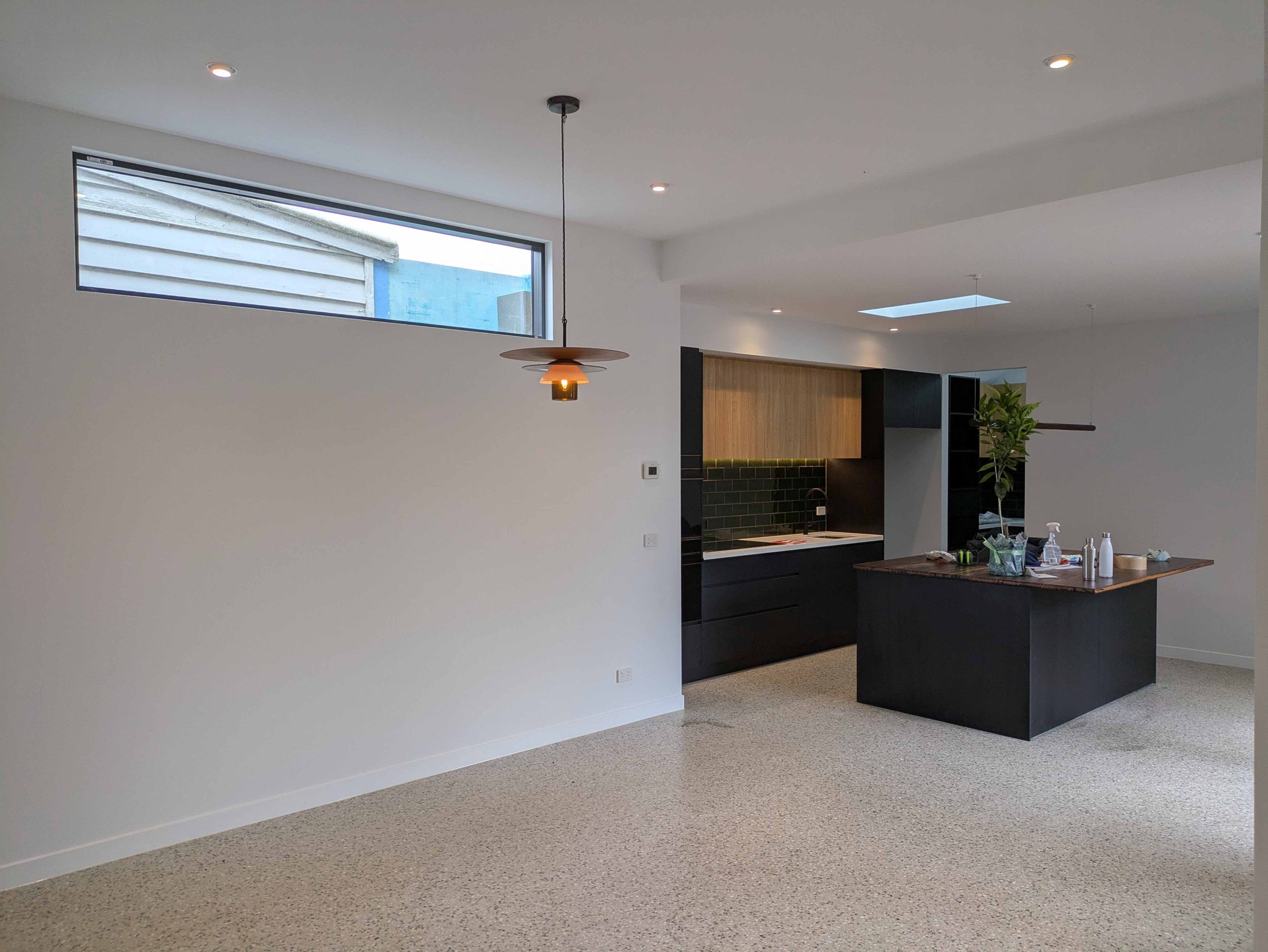
The most common neutral palette advice is still the least useful. “Paint it white” sounds safe, but in Melbourne homes it often produces the exact problems owners complain about later: rooms that feel cold, flat, sterile, or oddly unfinished even after a careful repaint.

A strong neutral interior doesn't come from one colour chip. It comes from undertone control, light response, finish selection, and disciplined contrast. That matters even more in Melbourne, where a south-facing room in Malvern reads very differently from a sun-filled apartment in Albert Park, and where period homes in Kew or Hawthorn carry details that either sharpen a neutral palette or get lost in it.

From a painter's perspective, neutral palette interior design works best when the decorating idea and the paint system support each other. The colour has to suit the light. The sheen has to suit the surface. The prep has to be good enough that subtle tones still look clean when the job is finished.

Table of Contents

What a Modern Neutral Palette Really Means

A modern neutral palette means controlled variation, not one-note white or grey used from skirting to ceiling.

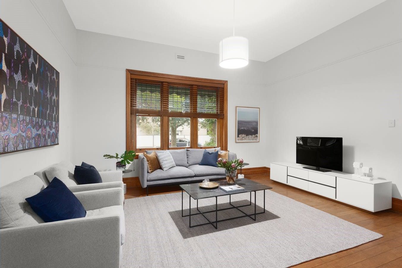
In practice, the better palettes use complex neutrals such as greige, taupe, soft stone, warm ivory, muted clay-beige, and off-whites with distinct undertones. Those undertones do the heavy lifting. Two paints can look similar on a sample card and behave completely differently once they're rolled across a full wall beside timber flooring, shadow lines, and natural light.

Modern neutrals start with undertones

If a neutral palette feels “off”, the problem usually isn't that the room needed more colour. It's that the undertones are fighting each other.

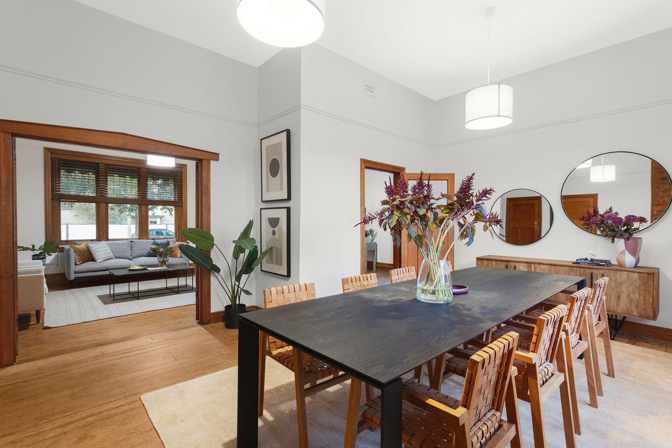
A warm greige can sit well with oak flooring, linen curtains, and brass hardware. A cooler grey in the same room can suddenly make the timber look orange and the walls feel lifeless. In older Melbourne houses, especially Victorian terraces and Federation homes, that clash shows up fast because there are usually more fixed elements in view, such as stained timber, ornate cornices, fireplaces, and detailed architraves.

A simple way to assess a neutral is to compare it against the room's fixed materials before painting starts:

  • Flooring first: timber, engineered boards, polished concrete, and carpet all shift how a neutral reads.
  • Trim and joinery next: period trims need a wall colour that supports their profile rather than flattening it.
  • Metal finishes matter: brass, black, stainless steel, and chrome each pull a neutral in a different direction.

Practical rule: Don't choose a neutral in isolation. Choose it against the surfaces that aren't changing.

The room should read layered, not blank

Good neutral palette interior design has a visual hierarchy. The walls aren't trying to do everything on their own.

That's why current design conversations have moved away from plain builder's white and toward warmer, more material-driven schemes. If you're tracking broader style shifts, these 2026 interior design trends are useful because they show how texture, natural materials, and contrast are shaping neutral rooms rather than replacing them.

From the painting side, this means choosing a wall colour that supports the full scheme, then using trim colour, sheen, and texture to stop the room feeling empty. It also means testing samples properly, on multiple walls and at different times of day, not trusting a single small swatch under artificial light.

For homeowners narrowing down shades, this guide to interior wall painting colours is a sensible starting point because it helps frame colour choice around the room, not just the paint chart.

How to Build a Balanced Neutral Palette for Your Room

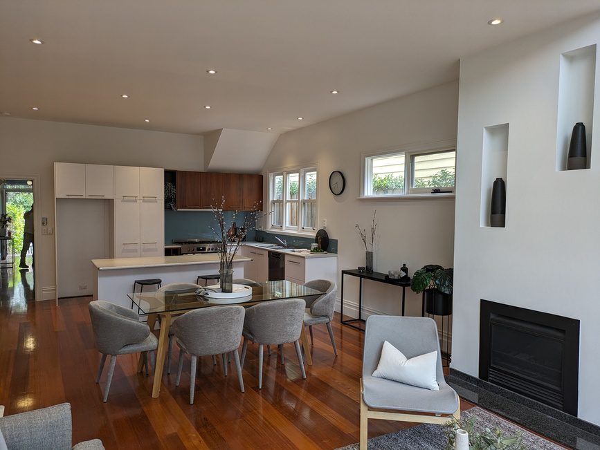
A neutral palette only looks expensive when each part of the room does a different job. If the walls, floor, joinery, and furniture all sit in the same tonal band, the result is what painters see all the time in Melbourne homes: a room that feels washed out rather than calm.

A digital illustration showing a designer sketching a living room interior following the 60-30-10 color rule.

Use the 60 30 10 rule properly

The 60 30 10 rule gives neutral rooms enough structure to avoid that flat, builder-grade look. Use 60% for the main neutral, usually the wall colour and large painted surfaces. Use 30% for a supporting neutral such as timber, stone, cabinetry, rugs, or upholstery. Use 10% for the darkest note in the room, often blackened steel, bronze, charcoal, deep timber, or darker trim details.

That darker portion matters more than owners expect.

Without it, a neutral room often has no stopping point for the eye. Clean paintwork alone will not fix that. I see this in renovated weatherboards and Victorian terraces across Melbourne, where soft white walls are paired with pale oak floors and light upholstery, then left there. Everything is pleasant, but nothing is defined.

Palette layer What it usually covers Common examples
Primary neutral Largest visual field Walls, large joinery faces
Secondary neutral Supporting mass Timber, rugs, cabinetry, upholstery
Dark accent neutral Definition and contrast Window frames, lighting, hardware, selected trims

The trade-off is straightforward. Too little contrast and the room feels vague. Too much dark detailing and a smaller room can start to feel chopped up. Most living areas handle a restrained dark accent well. In compact bedrooms or narrow hallways, keep those darker notes tighter and more deliberate.

Match the palette to Melbourne light

Orientation changes how a neutral reads on the wall. South-facing rooms in Melbourne usually need some warmth in the undertone, or the colour can turn cold and lifeless by afternoon. North-facing rooms can handle more restraint, because warm neutrals may read too creamy once full daylight hits them.

That shows up clearly in older homes. In a south-facing front room of an Edwardian or Victorian house, a grey-based white can flatten ornate plasterwork and make trims feel dull. A warmer off-white, greige, or soft taupe usually holds the detail better. In a bright apartment with large north-facing glazing, those same warmer paints can push yellow, so a quieter stone or controlled grey often finishes cleaner.

South-facing rooms usually need warmth under the neutral. North-facing rooms usually need more control.

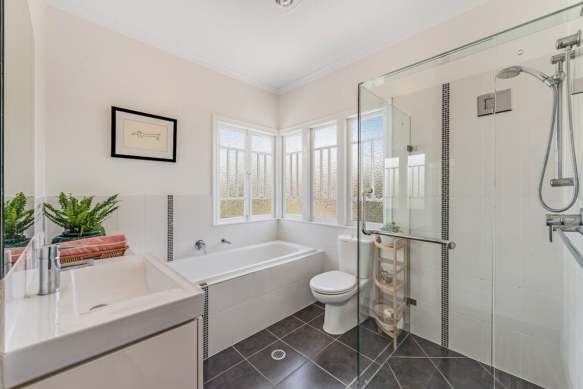
Room use affects the balance as well. Bedrooms can carry a softer spread between light and mid tones because the room is meant to settle. Kitchens, hallways, and open-plan living spaces usually need firmer separation, since hard finishes, shadow lines, and traffic make weak palettes look muddier faster.

For readers comparing broader interior design color strategies, the practical lesson is simple: build the palette from the fixed materials, the light, and the room's use. Then choose the paint.

If you're weighing options for a Melbourne property, this guide to choosing the perfect colour palette for house painting helps connect paint selection to orientation and finish choices.

A short visual reference helps here before samples go on the wall:

Using Sheen and Texture to Create Depth and Interest

If a neutral room feels sterile, the colour usually gets blamed first. Often the actual problem is flat execution.

Painters know this because the same colour can look refined in one room and lifeless in another, purely because the sheen levels, surface condition, and material contrast were handled differently. Neutral palette interior design depends on more than selecting the right greige.

Colour alone won't stop a neutral room feeling flat

In low-light rooms, especially inner-city Melbourne apartments, professionals often choose paints with Light Reflectance Value over 70 to keep the room from going flat. The same guidance notes that depth can then be created by pairing finishes, such as matte cabinetry against a low-sheen wall, rather than adding more colour, as explained in this Archivinci neutral interior palette article.

That matters in apartments around South Yarra, Richmond, or St Kilda where light can be limited by neighbouring buildings, narrow room widths, or shaded aspects. A low-LRV neutral in those rooms can absorb too much light and make the walls feel dead.

An infographic titled Sheen and Texture explaining the pros and cons of using diverse surfaces in neutral interiors.

A few combinations consistently work well:

  • Matte ceiling with low-sheen walls: hides minor ceiling imperfections and keeps wall surfaces washable.
  • Low-sheen acrylic walls with sharper trim: enough contrast to outline doors, skirtings, and architraves.
  • Brushed metal against timber or stone: stops the palette feeling too soft.

A neutral room needs contrast somewhere. If it doesn't come from colour, it has to come from sheen, texture, or material.

Choose finishes by surface, not by habit

Different surfaces need different finishes. Using one sheen everywhere is one of the quickest ways to make a neutral interior look unfinished.

A practical breakdown looks like this:

Surface What usually works Why
Ceilings Matte Minimises glare and hides surface irregularity
Living room walls Acrylic low-sheen Better washability, softer light reflection
Doors and trim Higher sheen enamel-style finish Cleaner lines, more durability, visible contrast
Cabinetry Finish selected to suit substrate and use Visual separation from walls

The finish also has to match the prep. Higher sheen products show defects more readily, so patching, sanding, and feathering have to be tighter. On heritage plaster, that can mean extra correction before the first undercoat goes on. On newer plasterboard, it often means checking joint lines and skimmed areas under angled light before top coats begin.

For a practical comparison of where each product type belongs, this overview of paint finishes for interior surfaces is useful.

Neutral Palette Examples in Melbourne Homes

Neutral palette interior design only makes sense when you see how it behaves in actual Melbourne housing stock.

The palette that works in a Federation house with ornate timberwork isn't the same one that works in a contemporary apartment with square-set ceilings and black-framed glazing. The goal is still cohesion, but the path changes with the building.

A Federation home with heritage trim

In a Kew or Camberwell Federation home, the neutral palette usually has to do two jobs at once. It needs to calm the interior and still respect the architecture.

That often means avoiding a stark all-white approach. If the walls, architraves, picture rails, and cornices are all pushed into the same bright note, the detailing disappears. A better result usually comes from a softer wall neutral with a cleaner trim contrast, so the mouldings, fireplaces, and hallway lines stay legible.

A painter also has to account for substrate age. Older trims may carry uneven build-up from previous repaints, and old plaster often needs more repair than owners expect. If the prep is rushed, subtle neutral colours expose every defect.

In heritage rooms, a neutral palette should clarify the architecture, not erase it.

A bright, airy living room with a green sofa, wooden coffee table, and child playing on the floor.

A contemporary apartment prepared for sale

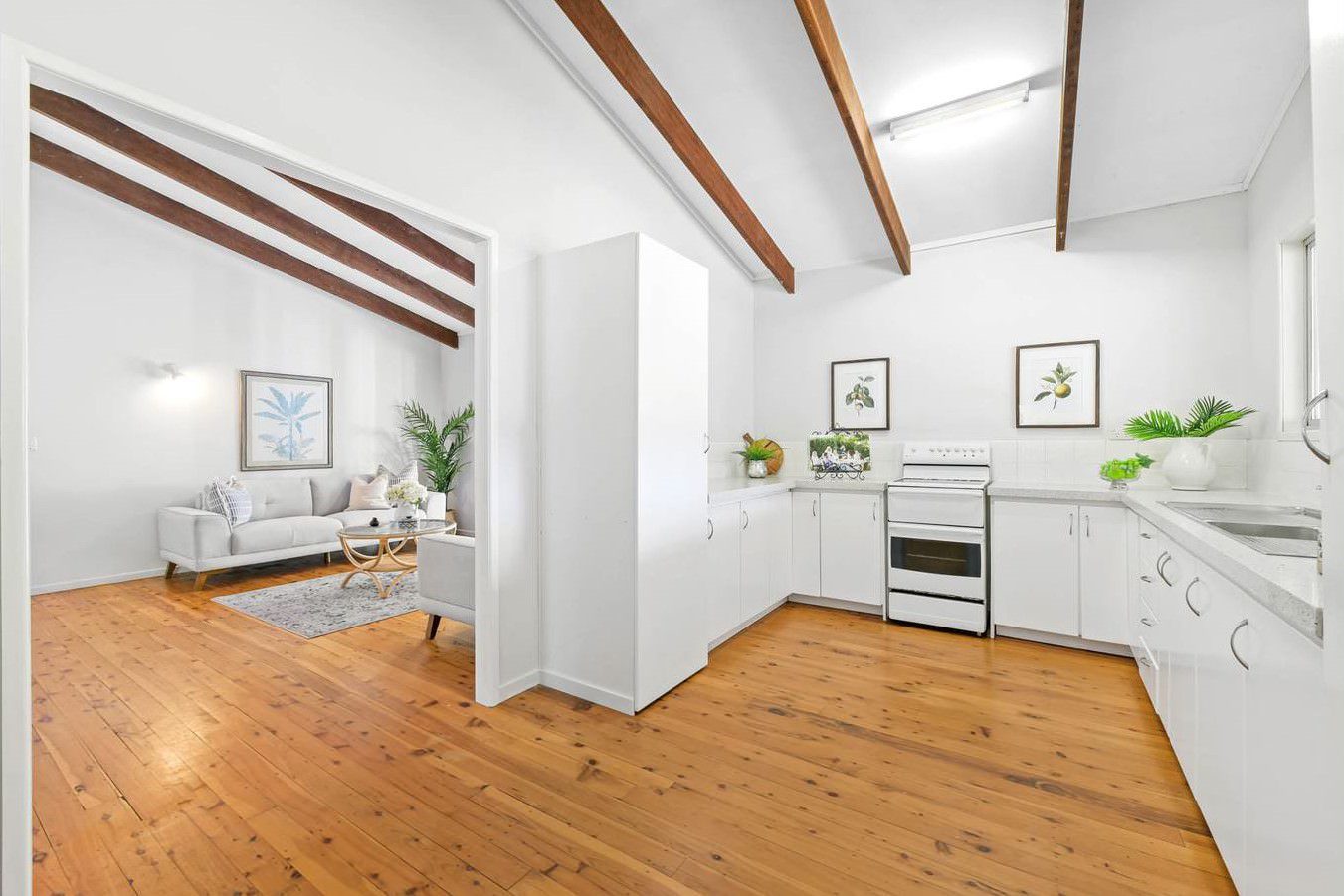
In a newer apartment in Toorak, South Yarra, or Armadale, the challenge is usually the opposite. There's less ornament, so the room depends more heavily on finish, lighting, and texture to feel complete.

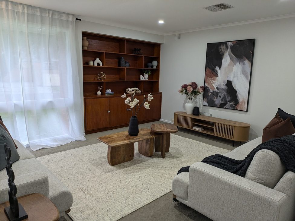
The conventional selling myth no longer holds. A flat neutral repaint isn't automatically the best pre-sale move. Recent Australian real estate data shows that homes with layered neutrals using textures such as linen, timber, and stone sell up to 12% faster than homes with a flat, single-note neutral, according to this Australian property styling discussion. In buyer terms, that textured neutral look reads as more luxurious and more considered.

That aligns with what agents want before a campaign. Ray White, Jellis Craig, Marshall White, Barry Plant, Fletchers, and Area Specialist listings often benefit from a repaint that feels current without looking generic. The painter's role is to create a clean backdrop, but not an empty one.

Three choices usually improve those apartments quickly:

  • Keep the wall neutral soft rather than stark: it works better with stone, engineered flooring, and warm lighting.
  • Use trim and door finishes to sharpen the lines: especially in hallways and open-plan living areas.
  • Support the paint with material contrast: linen, dark timber, wool, black hardware, and brushed metal all help the neutral read as deliberate.

Achieving a Professional Finish with Newline Painting

Neutral rooms are often judged as if the colour did all the work. On site, the finish usually comes down to prep, product choice, and application control. Pale greiges, off-whites, stone tones, and warm beiges are unforgiving in Melbourne homes, especially where side light hits older plaster, patched cornices, or worn trim.

That is why neutral work needs a tighter process than many repaint jobs. Fine filler edges, roller pressure, caulking lines, patch sealing, and sheen consistency all affect whether the room reads calm and expensive or flat and patchy. In Victorian terraces, 1970s brick homes, and newer apartments, the defects differ, but neutrals expose all of them.

Prep determines whether neutrals look refined or patchy

A proper scope comes first. It should set out what is being painted, what gets repaired, which paint system is being used, and what level of finish is realistic for the existing surfaces. In occupied homes, it also needs to cover access, protection, drying time, and how the room will stay usable during the job.

Preparation usually decides the result. On a neutral interior repaint, that can mean washing down cooking residue or dust, filling dents and settlement cracks, sanding back repairs, scraping loose material, sealing stains, caulking trim gaps, and applying the right primer before top coats go on. Skip one of those steps and the colour often looks wrong even when the tint is right.

Porosity is a common problem. One patched section of plaster can absorb paint differently from the surrounding wall, which leaves flashing under afternoon light. In a restrained palette, that kind of inconsistency stands out every day.

A practical sequence usually looks like this:

  1. Inspect problem areas and test adhesion on old enamel, water-affected sections, repaired plaster, and cornice lines.
  2. Protect floors, joinery, fixtures, and stone surfaces before sanding or cutting in.
  3. Repair and sand until patched areas sit flush and trim lines read clean.
  4. Prime or undercoat to suit the substrate so absorption and sheen stay even.
  5. Apply top coats with consistent spread and film build to avoid lap marks, flashing, and thin coverage.
  6. Check the finish in the room's actual light before sign-off, because neutrals can shift hard between morning and late afternoon.

The paint system and handover matter

Paint selection affects more than colour. It also affects washability, touch-up tolerance, and how much surface texture the finish will show. Lower-sheen walls can soften minor imperfections, but they mark more easily in hallways and family zones. Higher-sheen trim gives sharper definition around doors and skirts, but it also highlights sanding scratches and poor prep. Those are practical trade-offs, not styling details.

For clients trying to tie paint into furniture and styling choices, this guide to transforming Australian homes is a useful reference point. The painted finish still has to carry its share of the result.

Newline Painting, founded by Phi Dang, handles interior and exterior painting across Melbourne metro and surrounding Victoria. The company works with brands such as Dulux, Haymes, Taubmans, Berger, and Wattyl, and operates from 47 Claremont St, South Yarra VIC 3141. It carries $20M public liability insurance and provides written quotes, documented prep details, paint system selection, supervisor sign-off, and a final walkthrough. In neutral interiors, that paperwork matters because the margin for error is small.

Handover should be treated as part of the finish. Keep the quote, invoice, product details, and any notes about exclusions or maintenance. If a wall needs future touch-ups, knowing the exact product line and sheen level saves a lot of guesswork, and it helps the room stay consistent rather than slowly turning into a patchwork of close-enough whites.

Start Your Neutral Palette Project with Confidence

A neutral interior works when it feels intentional. If it only feels safe, it usually won't feel finished.

The strongest results come from getting four decisions right at the same time: undertone, light, sheen, and contrast. Once those align, the palette starts to look layered instead of blank. That's as true in a weatherboard renovation in Brighton as it is in an apartment refresh in South Yarra.

What separates a polished neutral interior from a bland one

A successful neutral room doesn't rely on white walls to do all the work. It uses a balanced palette, it responds properly to the room's orientation, and it builds depth through finish and material variation.

That's why the painter's role matters. Surface correction, primer selection, coat build, and sheen control all shape how the final colour reads. In restrained interiors, those details are visible every day.

If you're collecting broader ideas before choosing your final scheme, this guide to transforming Australian homes is a helpful reference for how soft furnishings and room styling support a painted neutral backdrop.

For Melbourne homeowners, builders, agents, and property managers, the practical takeaway is simple:

  • Test neutrals in the actual room light
  • Choose finishes to suit each surface
  • Don't skip contrast
  • Treat prep as part of the design outcome

A neutral palette should make the room feel resolved, not merely repainted.


If you're planning a neutral interior repaint in Melbourne and want a clear opinion on colour direction, surface prep, and finish selection, request a free on-site quote from Newline Painting or call 1300 044 206.

Leave a Comment