Choosing an exterior colour usually feels like the big decision. In practice, it's only one part of what makes a repaint hold up in Melbourne. A front elevation can look right on a sample card and still disappoint once it meets full sun, winter moisture, wind-driven rain, or bayside salt air.

That's why the best exterior house painting ideas aren't just about style. They tie colour to substrate, preparation, coating system, and the nature of the home itself. A weatherboard in Kew needs a different approach from a rendered townhouse in Richmond, and both need more thought than picking “white with black trim” from a mood board.

At Newline Painting, we see this every week on-site. Federation homes, Victorian terraces, contemporary duplexes, apartment blocks, older brick veneers. The finish that lasts is the one planned properly from the start, especially when Melbourne gives you four seasons in a day.

If you're still narrowing ideas, it also helps to look at the house as a whole, including glazing, gutters, paths, and presentation. Clean windows can change how an exterior colour reads, so if you're preparing for photos or sale, Cultivate House Detailing's window washing is one practical part of the presentation.

Table of Contents

1. Modern Minimalist Two-Tone Exterior

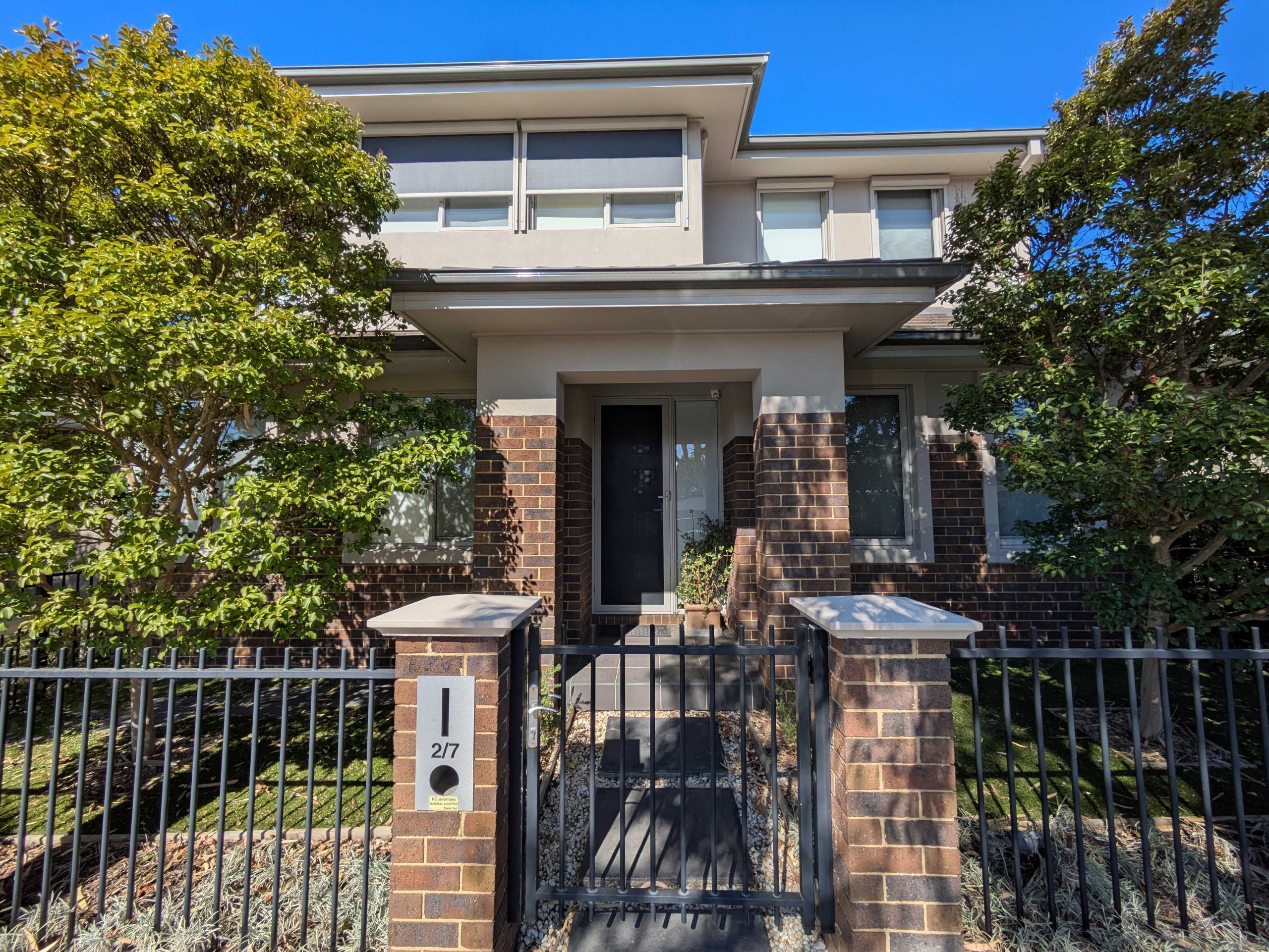
You see this style all over Melbourne for a reason. A simple two-tone scheme gives a house a sharper outline, cleans up busy façades, and updates older homes without pushing them into a trend that dates quickly.

A woman walks toward the front door of a modern light-colored house with minimalist architectural design features.

Done well, it suits modern townhouses, weatherboards with updated joinery, and period homes that need a quieter colour scheme. Done badly, it can make the front elevation look chopped up. The difference comes down to where the contrast sits and how the paint system handles the surface underneath.

In Melbourne, I usually recommend keeping the main wall colour lighter, then using the darker tone on trim, windows, doors, garage panels, or a defined architectural band. That approach holds up across different light conditions and works with the mix of brick, timber, render, and cement sheet you often get on one façade.

Where two-tone schemes work best

On Victorian and Edwardian homes, the colour break needs to follow real architectural lines. Fascias, window frames, fretwork, verandah posts, and entry doors already give you the framework. If the darker tone is dropped onto random wall sections just to create contrast, the result looks decorative rather than resolved.

On newer render homes, restraint matters even more. Large flat surfaces can look clean and expensive with only one accent colour, but every joint, patch, and roller mark will show if prep is poor. A minimalist scheme is less forgiving than many owners expect.

These combinations usually work well on Melbourne homes:

  • Soft greige with charcoal trim: A good fit for renovated period homes that need a current finish without losing their original detailing.
  • Warm white with deep green accents: Strong on townhouses and contemporary infill builds, especially where gardens, dark window frames, or timber entry doors are already part of the design.
  • Light stone with navy details: Useful on bayside and high-light sites where pale colours can wash out unless the trim has enough contrast.

Large sample boards matter here. Exterior light will flatten colour, and south-facing elevations can read completely differently from the front fence than they do beside the wall.

If you're planning a full repaint, exterior house painting in Melbourne comes down to execution as much as colour choice. Clean cut-in lines, the right sheen on trim, and proper prep on timber, render, or previously painted masonry are what make a two-tone exterior look crisp and intentional.

2. Warm Earth Tones & Terracotta Accents

Warm earthy colours work best when the house already has natural materials that need a bridge colour, not a competing one. Think brick paths, terracotta roof tiles, sandstone tones, timber doors, or mature gardens. In Hawthorn, Camberwell, and other established suburbs, these schemes can soften a home without making it look washed out.

Australian design coverage in 2025 points to continued movement toward warm whites, muted earthy neutrals, and deeper heritage-inspired accents, as noted in this Australian design trend discussion on YouTube. That lines up with what many owners ask for now. They want warmth, but not yellow. Depth, but not a full heritage palette.

How to stop earth tones looking dated

The mistake is usually in the undertone. If the body colour leans orange and the trim is also warm, the whole façade can swing retro very quickly. A better approach is a grounded warm base with cleaner trim and a darker accent on the front door or selected architectural details.

On-site, these combinations usually work better than people expect:

  • Warm sand body with off-white trim: Good for weatherboards and lighter brick homes.
  • Muted clay accent with a restrained neutral field colour: Better than covering the whole exterior in terracotta.
  • Earthy taupe with charcoal or bronze details: Useful on updated 1970s or 1980s façades.

Earth tones also need disciplined sampling. Morning shade, full afternoon sun, and overcast conditions can all shift the read. A colour that looks elegant on a fan deck can suddenly pull pink, peach, or mustard outside.

Earth tones are forgiving on dust and general wear, but they're unforgiving when the undertone clashes with the roof, paving, or brick base.

3. Feature Wall Accent Painting

A feature wall outside works when the architecture already gives you a natural focal point. If it doesn't, you can end up creating visual noise instead of a statement. On terraces, compact townhouses, and some modern builds, a single accent wall or entry element can sharpen the whole front elevation.

A modern single-story house with green accents and a wooden front door, surrounded by watercolor-style landscaping.

This can be a smart option when you don't want a full bold exterior but still want the home to feel current. A navy wall around the entry, a sage gable end, or a terracotta-toned recessed section can all work. The key is using the accent to support the architecture, not fight it.

Choosing the right wall to highlight

The best candidate is usually the wall that already carries visual importance. That might be the front entry, an upper-level box frame, a rendered blade wall, or a gable. It's rarely every wall facing the street.

A few trade-offs to weigh up:

  • Bold colours sharpen geometry: Great on newer builds with strong lines.
  • Low-contrast accents are often pointless: If the accent barely separates from the main body, the effect gets lost.
  • Edges need to be exact: Accent walls expose shaky cut lines immediately, especially against pale adjacent colours.

In Richmond and Northcote, this style often suits compact façades where a full palette shift would feel heavy-handed. On larger period homes, though, one bold wall can look disconnected unless the accent also appears in the door, ironwork, or trim.

If you want impact, commit to one strong move and execute it cleanly. Half-committed accents are what make this idea fail.

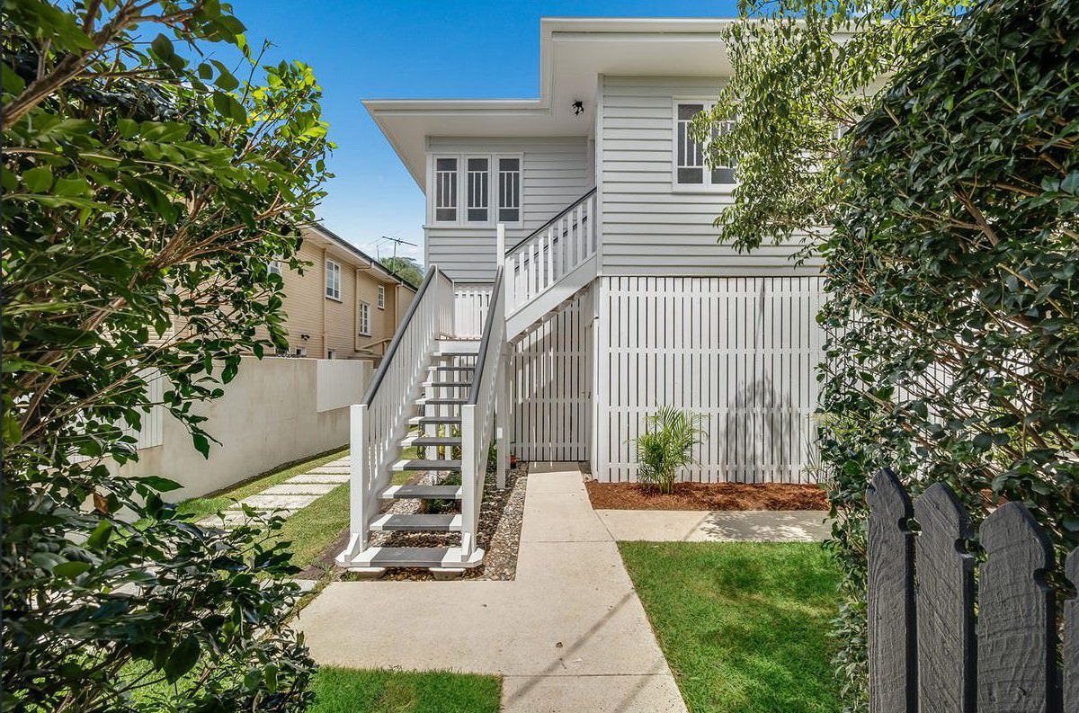
4. Weatherboard Refresh with Fresh Whites & Creams

A tired Melbourne weatherboard can change quickly with the right white or cream, but this scheme only works when the colour suits the age of the house and the surface underneath is sound. On Victorian and Edwardian homes, a softer white or warm cream usually sits better with the timber detailing, roof colour, and surrounding gardens than a sharp architectural white. In our light, cooler whites can read flat or blue by late afternoon, especially on south-facing fronts.

These palettes stay popular because they make older façades look cleaner, lighter, and more cared for without forcing a dramatic style change. They also fit a wide range of local housing stock, from single-fronted cottages in the inner north to broader family homes in Balwyn, Kew, and Malvern. If the goal is to freshen the street presence while keeping the house believable for its era, whites and creams are often the safest call.

Prep matters more than the colour card

On weatherboard, coating failure usually starts at joints, board ends, and old repair areas. That is where moisture gets in, paint loses adhesion, and new topcoats start showing the same defects as the old ones. A clean colour scheme will not hide that.

A proper repaint usually includes:

  • Washing and decontamination: Remove dirt, chalky residue, cobwebs, and mould before any sanding or priming starts.
  • Timber repairs and filling: Replace rotten sections, seal open joints, and fill damaged areas so the finish looks even from the street and up close.
  • Targeted priming: Prime bare timber, stained patches, and fillers with products suited to each surface, rather than relying on one general undercoat.

Many older Melbourne weatherboards have been painted over again and again. You can see it in softened edges, bridged joints, and old peeling around board laps. If that build-up is not handled properly, fresh whites tend to expose the flaws rather than soften them.

For homes with that kind of substrate history, weatherboard painting in Melbourne is less about chasing a trend and more about getting the boards stable, sealed, and sharp enough to carry a light colour well.

Trim choice matters too. A warm white on the main boards with a slightly stronger cream on trims and window surrounds can give the façade shape without making it busy. On plainer homes, that small shift in tone often looks better than using one white everywhere, which can leave the frontage washed out under hard sun.

5. Modern Render with Textured Finishes

Texture is a good idea when the façade feels too flat in a single colour, or when minor surface inconsistency makes a perfectly smooth finish unrealistic. Fine texture can add depth without making the house look heavy. On newer townhouses and apartment exteriors, it can also help break up broad rendered planes that would otherwise read as blank.

A subtle texture often performs better than a dramatic one. Fine sand-style finishes usually suit contemporary work better than coarse patterns, especially where the architecture is already doing most of the visual work.

Texture changes how colour reads

The same colour will look different on a textured surface than it does on a smooth sample board. High points catch light, recesses hold shadow, and the façade can read darker or more varied across the day. That's why texture samples need to be tested as a system, not just as colour.

Here's a visual example of how texture can change the result:

What usually works best on Melbourne render:

  • Fine texture with muted neutrals: Suits modern façades and keeps the look controlled.
  • Texture on selected volumes only: Better than applying it everywhere if the building already has enough detail.
  • Stable weather windows: Moisture and inconsistent drying can affect uniformity across larger wall areas.

Textured finishes can hide minor visual irregularities, but they won't hide structural cracks or substrate movement. If the render is unstable, that needs repair first.

6. Heritage-Sympathetic Period Colour Schemes

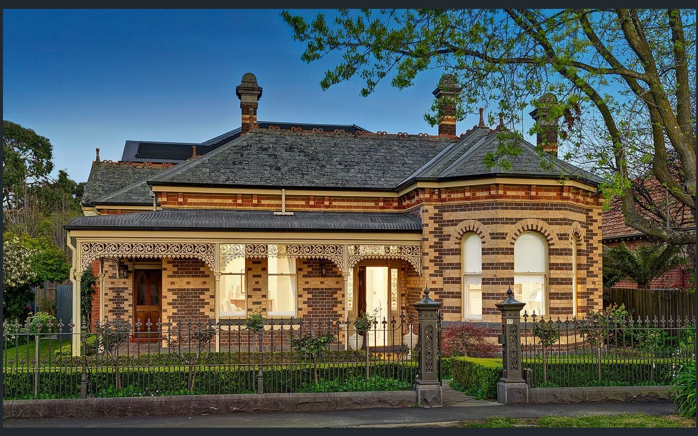
You see this all over Melbourne. A Victorian terrace or Federation home gets painted in colours that would suit a new townhouse, and the façade loses its hierarchy straight away. Period houses read well when the body, trim, and accent colours follow the original detailing instead of competing with it.

That matters in suburbs with older housing stock such as Kew, Armadale, Albert Park, and Hawthorn. Verandah brackets, sash windows, fretwork, tuckpointed brick, weatherboards, and gable ends were designed to create depth through shadow and proportion. The paint scheme needs to support that. On a heritage exterior, colour placement usually matters more than chasing a fashionable swatch.

The safest approach is restraint. One main body colour, one trim colour, and one or two accent colours is often enough to define key elements without making the elevation look busy. The practical trade-off is simple. More colours can highlight beautiful period detail, but they also create more cut-in work, more room for inconsistency, and a fussier result if the placement is not disciplined.

I usually start by deciding what should sit back and what should stand forward. On an Edwardian weatherboard, a soft body colour with a crisp but not stark trim often keeps the house looking clean without stripping away character. On a red brick Federation home, paint is often better reserved for timber gables, eaves, windows, and verandah elements rather than trying to force uniformity across the whole façade. For guidance on suitable heritage colour approaches, Heritage Victoria publishes advice on exterior finishes and historically appropriate treatment in its conservation resources: Heritage Victoria guidance on external paint and finishes.

Preparation is usually the deciding factor on these jobs. Older timber profiles hold failed paint in edges and corners, previous repairs are rarely flush, and hard modern fillers can stand proud once topcoated. Heritage exteriors often need more scraping, more selective sanding, more patch repairs, and tighter control over film build so mouldings stay sharp.

That is where experience shows up on the finished house. Newline Painting handles this kind of work with trade-qualified painters, which matters when the brief is to protect ageing substrates, keep period detail readable, and use a paint system that stands up to Melbourne's mix of sun, rain, and temperature swings.

7. Contemporary Dark & Moody Exteriors

Dark exteriors can look sharp, architectural, and expensive when the house has the right form for them. They suit boxy contemporary builds, renovated brick façades, and some period homes where you want a deliberate contrast with lighter landscaping or stonework. Charcoal, graphite, deep green, and navy are the usual safe end of the darker palette.

A modern two-story dark exterior house with stone accents and a woman walking towards the garage.

They are not a shortcut, though. Dark colours are less forgiving than people think. They amplify patchiness, roller lap marks, filler flashing, and uneven surface prep.

Dark colours expose prep quality

If the substrate is wavy, cracked, or poorly repaired, dark paint will show it. On weatherboard, you'll notice joint inconsistencies faster. On render, repairs can telegraph through. On timber trim, poorly sanded edges stand out immediately.

A 2024 review of Australian climate data noted that heat extremes, UV exposure, and coastal salt exposure are intensifying repaint wear, which is why durability advice matters as much as aesthetics in local exterior work, as discussed in this Australian climate durability overview referenced in the verified data. That's especially relevant when clients want deeper colours on exposed elevations.

A few hard truths about dark schemes:

  • North and west-facing walls take more punishment: Colour depth can fade sooner if the system isn't chosen properly.
  • Extra prep isn't optional: Dark paint won't hide mediocre workmanship.
  • Balance matters: One dark body colour usually needs lighter paving, softer planting, timber, or contrasting trim nearby.

Done well, dark exteriors look deliberate. Done poorly, they look tired much faster than lighter schemes.

8. Low-Maintenance Render & Façade Painting Systems

A rendered front in Melbourne can look sharp for years, or start showing hairline cracks, staining, and patchy fade far sooner than expected. The difference usually comes back to the paint system and the prep behind it.

Low-maintenance work starts with the substrate. Rendered façades deal with movement, moisture, UV, pollution, and, on some blocks, wind-driven rain. Colour still matters, but on render I choose the system first. That means the right primer for the surface condition, a quality acrylic topcoat with enough flexibility for minor movement, and mould-resistant products where shaded or damp elevations need them.

This approach suits owner-occupiers, investors, and property managers alike because it cuts down premature repairs and awkward patch jobs.

System selection comes first on render

On a sound façade, a proven low-sheen acrylic system over careful prep will usually outlast a trend-led colour choice applied over unstable render. If the walls already have hairline cracking, drummy patches, chalking, or old repairs, those issues need to be assessed before the first coat is priced.

The better specifications usually include:

  • Condition-based prep: Crack filling, patching, sanding, washing, and spot-priming matched to the actual façade, not a generic allowance.
  • Clear product details: The quote names the primer, membrane or topcoat type, and finish level instead of hiding behind “premium paint”.
  • Future maintenance notes: Owners know what system was used, which makes later touch-ups and recoats more straightforward.

Different façades need different treatment. Older render on solid masonry often needs more breathable, cautious coating choices than newer cement render on a modern extension. Acrylic texture coatings can hide minor surface inconsistency, but they also make repairs more obvious if the texture is not matched properly. Smooth modern render gives a cleaner architectural look, yet it shows patching, sanding marks, and shrinkage cracks much faster.

Brand matters less than suitability. Dulux, Haymes, Taubmans, Berger, and Wattyl all have systems that can perform well if the surface is stable and the specification matches the exposure.

If part of the façade includes masonry or painted brick, the coating choice also needs to stay compatible with those surfaces. This guide on painting brick walls properly is a useful reference when a rendered frontage wraps into brick side walls or boundary elements.

9. Brick & Masonry Painting & Sealing

Painting brick can work well, but only when there's a reason to do it and the product selection is correct. It can modernise dated brick veneers, unify mismatched additions, or clean up heavily patched masonry. Sealing, on the other hand, is often the better move when the brick character is worth keeping but the surface needs protection and a cleaner appearance.

Brick jobs fail when painters treat masonry like timber or plasterboard. It isn't. It holds moisture differently, it can have salts, old sealers, and variable porosity, and it needs breathable coating choices.

Breathability is the non-negotiable

Before painting brick, the surface has to be assessed for previous coatings, moisture issues, and condition. A breathable masonry coating is critical. If moisture gets trapped behind the film, problems follow.

The substrate also needs slower, more deliberate prep than many owners expect:

  • Cleaning first: Brick must be free from dirt, efflorescence, and loose material before any primer goes on.
  • Compatibility check: Previously sealed or painted masonry needs product matching, not guesswork.
  • Longer cure awareness: Masonry doesn't behave like timber trim. Rushing recoat windows can compromise adhesion.

Some brick should be painted. Some brick should be left alone and sealed. The right answer depends on condition, age, prior coatings, and the look you're trying to achieve.

If you're weighing up those options, painting brick walls and masonry surfaces needs a substrate-first approach. That's far more important than whether the final colour is white, grey, or charcoal.

10. Multi-Story & Apartment Complex Professional Repainting

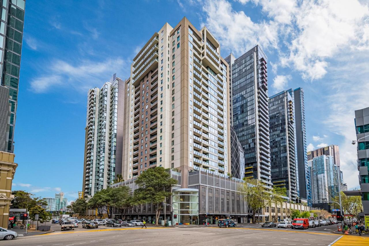
A three-storey block can look straightforward from the street. Once work starts, the main job is coordination. Access equipment, resident entry points, drying times, parked cars, body corporate approvals, and weather delays all affect the result.

Multi-story and apartment complex repainting needs a tighter system than a single-home exterior. In Melbourne, that matters even more because wind, cold mornings, and changeable weather can interrupt washing, repairs, priming, and topcoats across different elevations. One shaded wall can stay damp while the northern face is ready to coat. If the sequence is wrong, the finish quality becomes inconsistent.

Owners corporations and property managers should focus on method, not sales language. On occupied sites, the standard is simple. Residents need clear notice, safe access, tidy work areas, and predictable progress.

A capable contractor should be able to show:

  • A written scope and staging plan: Which elevations are done first, how access is managed, what repairs are included, and how primers and topcoats are specified for each substrate.
  • Insurance that suits occupied residential work: Newline Painting carries $20M public liability insurance, which is a basic requirement on larger live sites.
  • A clear defects and handover process: A 7-year workmanship warranty gives owners and managers a defined post-project reference point.

The practical issues are rarely about colour alone. On larger townhouse rows and apartment blocks, consistency is usually the bigger challenge. Trim lines need to match from unit to unit. Repairs have to blend across patched render, timber details, and previously coated surfaces. Dark colours can look sharp on a modern complex, but they also show lap marks, patchiness, and substrate variation more readily, especially in strong western light.

Communication keeps these jobs on track. For apartment blocks in South Yarra, St Kilda, or inner-east townhouse complexes, access notices, weather updates, daily cleanup, and a proper final walkthrough are part of the work, not extras. That is usually what separates a controlled repaint from a disruptive one.

Exterior House Painting Ideas, 10-Point Comparison

Style / Treatment Complexity 🔄 Resources & Cost ⚡ Expected Outcomes ⭐ / 📊 Ideal Use Cases Pro Tips 💡
Modern Minimalist Two-Tone Exterior Moderate, precise trim transitions and colour selection Moderate, two paints, skilled painters; typical project cost High curb appeal and timeless modern look; strong pre-sale uplift Contemporary builds, inner-city homes, pre-sale makeovers Test large swatches, ensure clear contrast, use premium paints
Warm Earth Tones & Terracotta Accents Low–Moderate, careful undertone handling needed Moderate, standard paints; UV‑protective recommended Warm, inviting and landscape‑friendly aesthetic; durable appeal Period homes, established suburbs, gardened properties View samples at different times; avoid orange undertones
Feature Wall Accent Painting Low, targeted application but requires clean edges Low, economical (less paint, focused labour) High visual impact with minimal investment; draws attention to features Pre‑sale focus walls, front facades, townhouses Choose street‑facing wall, test bold colours, coordinate accents
Weatherboard Refresh with Fresh Whites & Creams High, extensive surface prep for weatherboard Moderate, prep increases cost; premium weatherboard paint advised Fresh, period‑authentic modernisation; strong buyer appeal Victorian/Edwardian weatherboards, heritage streetscapes Invest in prep (power‑wash/sand/repair); pick softer whites
Modern Render with Textured Finishes High, specialist texture application and skill required High, specialised texture products and experienced applicators Sophisticated depth and tactile quality; hides minor imperfections Contemporary apartments, new builds, render‑clad homes Trial texture samples, hire experienced applicators, consider maintenance
Heritage‑Sympathetic Period Colour Schemes High, research, consultation, possible approvals Moderate–High, consultancy or special paints may add cost Preserves authenticity and historical value; appeals to niche buyers Heritage‑listed properties, period restorations, conservation areas Consult Heritage Victoria, consider paint‑layer analysis and documentation
Contemporary Dark & Moody Exteriors Moderate–High, flawless prep essential for even finish Moderate, premium dark paints, possible extra coats Striking, luxury aesthetic; hides wear but can accentuate imperfections Contemporary homes, inner‑city and trendy suburbs, pre‑sale Test in varied light, ensure superb prep, balance with light trim
Low‑Maintenance Render & Façade Painting Systems Moderate, correct system specification and application High upfront cost; long‑term savings on maintenance Long‑lasting durability, mould resistance, extended repaint cycles Apartments, exposed facades, investment properties Verify system, request installer experience and warranty details
Brick & Masonry Painting & Sealing High, masonry prep and breathable product selection critical Moderate–High, intensive prep and specialist materials Transforms and protects brick; generally permanent change 1970s–1980s brick modernisations, weathered facades, pre‑sale Use breathable masonry paints, test inconspicuous area, check heritage rules
Multi‑Story & Apartment Complex Professional Repainting Very High, project management, safety systems, resident coordination Very High, scaffolding, EWP, large crews, insurance and logistics Professional compliant outcome with minimal disruption when well managed Strata‑managed buildings, townhouse developments, large portfolios Obtain detailed quotes, verify insurance/licences, plan resident communication

From Idea to Impeccable Finish Your Next Steps

You pick a colour in the morning sun, approve it, and two weeks later it looks different under a grey Melbourne afternoon. That is usually the point where owners realise the result depends on more than the colour card.

Start with the surface in front of you. Weatherboards often need filling, selective board replacement, spot priming, and careful sealing around joints. Render needs crack assessment, moisture checks, and a coating system that suits the existing finish. Brick needs a breathability check before painting is even on the table. Skip those steps and the finish can fail early, no matter how good the colour choice looked at quote stage.

Your timeframe matters as well. Owners planning to stay usually have more room to choose stronger contrast, darker trims, or a front door colour that stands out. If the house is being prepared for sale, broad-appeal neutrals are often the safer call. I give different advice to a family restoring a period home in Camberwell than I do to a vendor repainting a brick veneer in the outer east. The right answer depends on who needs the paint job to work, and for how long.

Paint system selection affects the day-to-day experience of the project. Low-odour, low-VOC products can make a real difference when people are living on site, especially around windows, doors, eaves, and covered outdoor areas where fumes tend to linger. They also need to be matched properly to the substrate. A premium system only performs well when the primer, undercoats, and topcoats are specified for that surface and exposure level.

Brand names matter less than system fit.

Good exterior painting also has to read well from the street. Roof colour, paving, planting, fencing, and other hardscaping all influence how the finished paint sits on the block, which is why tools like an ai landscape design generator can be useful during early planning.

The next step is simple. Get an on-site assessment and ask for a written scope that sets out the prep, primer, topcoat system, access method, and how hidden failures will be handled once washing, scraping, and repairs begin. If Newline Painting is one of the companies you speak with, that process includes a detailed written quote, paint system selection, and workmanship backed by a 7-year warranty.

If you want a clear plan for your repaint, request a free on-site quote from Newline Painting. We service Melbourne homes, apartments, and selected larger residential projects, and you can also call 1300 044 206 to discuss the scope, timing, and best exterior painting approach for your property.

Leave a Comment