How To Use A Paint Colour Chart
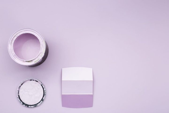
We give you the best expert advice to paint your house like a pro!
The paint colour chart or colour wheel depicts both primary and secondary colours. However, there are thousands of shades and each paint manufacturer have their unique name and description for each colour. It’s quite easy to become confused by all the choices.
So, in this article, our ‘How to Paint Your House’ tips will teach you to use the paint colour chart. We start by explaining the colour wheel and some basic colour theories. Once you understand the concept, you will gain a sense of how to match colours.
Here Are 10 Room Colour Meanings and How it Affects You
THE PAINT COLOUR CHART
The first circular diagram of colour was developed by Sir Isaac Newton back in 1666. While there are many versions of a colour wheel the basic concept is the same; it is a collection of hues arranged in a circular formation in a logical sequence.
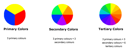
Primary colours
Traditional paints and pigments have only three basic colours: Yellow, Blue and Red. All colours are derived from these three traditional colours.
Secondary colours
Secondary colours are formed by combining two primary colours.
Yellow + Blue = Green
Yellow + Red = Orange
Blue + Red = Violet (or Purple)
Tertiary colours
Tertiary colours are formed by combining a primary colour with a secondary colour. The hue (colour) is a two-word name:
Yellow + Orange = Yellow-orange
Red + Orange = Red-orange
Red + Violet = Red-violet
Blue + Violet = Blue-violet
Blue + Green = Blue-green
Yellow + Green = Yellow-green
Colours are also known as hues and the graduations of the hues (i.e. light or dark) are called shades. Also, in colour theory, a tint is a colour that has white mixed into it to lighten its shade. Whereas, a tone is a colour that has grey added to it to darken its shade.
WARM COLOURS VS COOL COLOURS
Colours like reds and yellows are considered warm colours while blues and greens are cool colours on the paint colour chart. Purple can be either warm or cool depending on its shade. Light lavender is a cool colour, but deep magenta is considered a warm colour.
Colour Harmony
Harmony is a satisfying or appealing arrangement. In visual experiences, harmony is pleasing to the eye. Harmony evokes balance and simulates interest. Disharmony on the other eye can be boring or chaotic.
Contrasting colours
Contrasting colours are not opposite colours but work well together. Match a deep or bold colour from one end of the spectrum with a lighter colour to create a more striking look.

Here’s an example of a contrasting colour scheme from Dulux: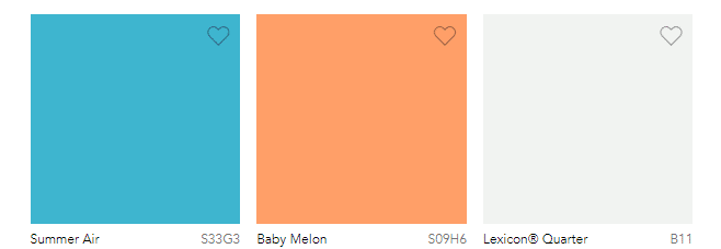
Complementary colours
Complementary colours are colours on opposite sides of one another in a 12-colour wheel. For example:
Primary vs primary: red and green, blue, and orange, red, and green
Tertiary vs tertiary: red-violet and yellow-green
Complementary colours add brightness to the overall look. 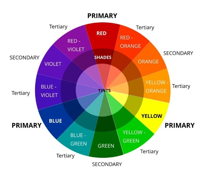
Here’s a example of complementary colour scheme from Dulux: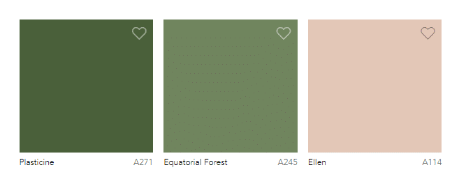
Split Complementary
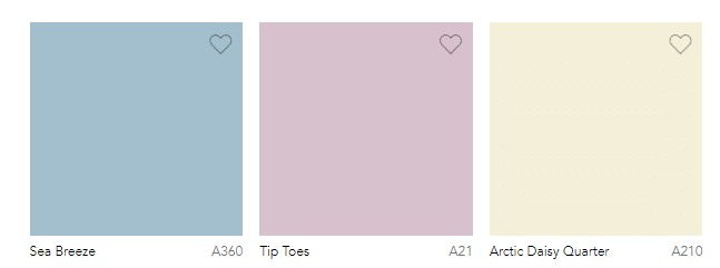
Split complementary colours are a variation in complementary colours. It uses two adjacent colours. It is a softer version of the complementary colour scheme.  Here’s an example of a split complementary colour scheme from Dulux Paint Colour Chart:
Monochromatic
Monochrome is a variation of a single colour. Light tones create a relaxed and serene atmosphere. Dark tones are rich and deep. Combining light and dark can add interesting contrast and energy to a room.
Here’s an example of a monochromatic colour scheme from Dulux: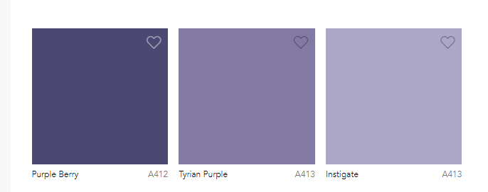
Triadic
A triadic colour is three different colours on the colour wheel. They can be contrasting, complementary or monochromatic. The match can produce a harmonious range of colours that are brighter and more vibrant for the room. Here’s an example of a triadic colour scheme from Dulux:
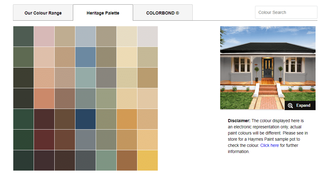
COLOUR GROUPS
Every paint manufacturer creates and names its range of paint colours. Paint manufacturers group colours into a collection of matching colours to make it easier for you to choose the colours you like.
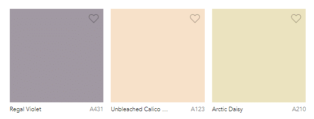
Here’s a sample of a ‘heritage’ palette from Haymes Paint:
COLOUR INSPIRATION
KITCHENS
The kitchen is one of the most welcoming rooms in the home. It’s the place where we gather for breakfast and cook delicious meals for family and friends. If you are a creative cook, you may want to consider an exciting colour palette to inspire you. If you are looking for a calming environment to prepare family meals, cool tones are better.
Bringing colour to the kitchen is not just about painting the walls. Match your paint to other elements like the flooring, tiles, backsplash, and benchtop. If your kitchen is an open-plan design that flows into another room (for example, a family room) you may want to consider complementary colours from the paint colour chart to create a flow.
Here are some ideas to inspire you:
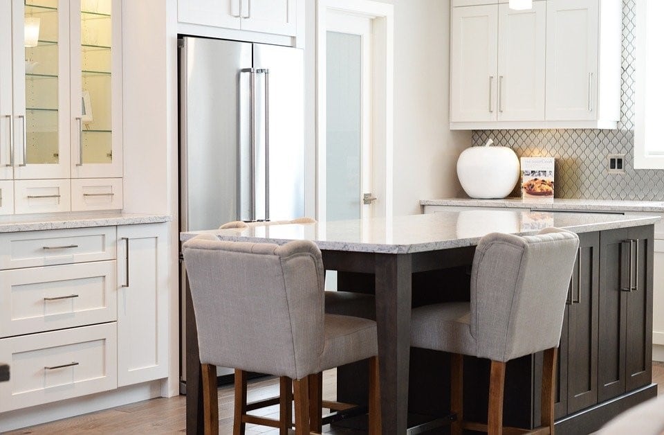 Classic white. Choose an off-white rather than pure white because pure white can be a little harsh. A beige-tint will appear whitish but will have a touch of warmth in it.
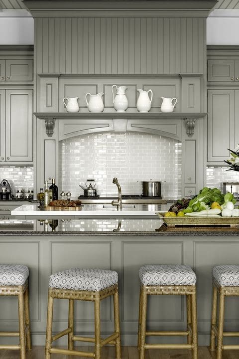
Grey is a popular choice for a modern, contemporary kitchen look. Kitchen cabinetry painted in grey adds class and sophistication to the kitchen.
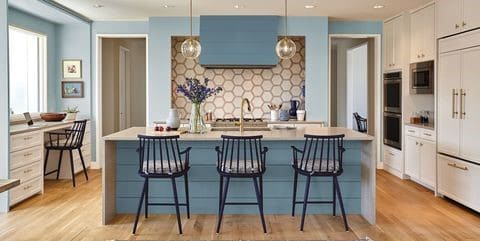
Mid-blue is an ideal shade that pairs well with most things including hardwood floors, tiles, and a patterned backsplash.
BATHROOMS
Bathrooms are intimate and personal spaces. They are small spaces and can sometimes be a cluttered environment with towel rails, vanity, and showers/baths. Avoid using too many colours when painting your bathroom. Blues and greens are calming and popular choices for bathrooms because they make the room look bigger.
Here are some ideas to inspire you:
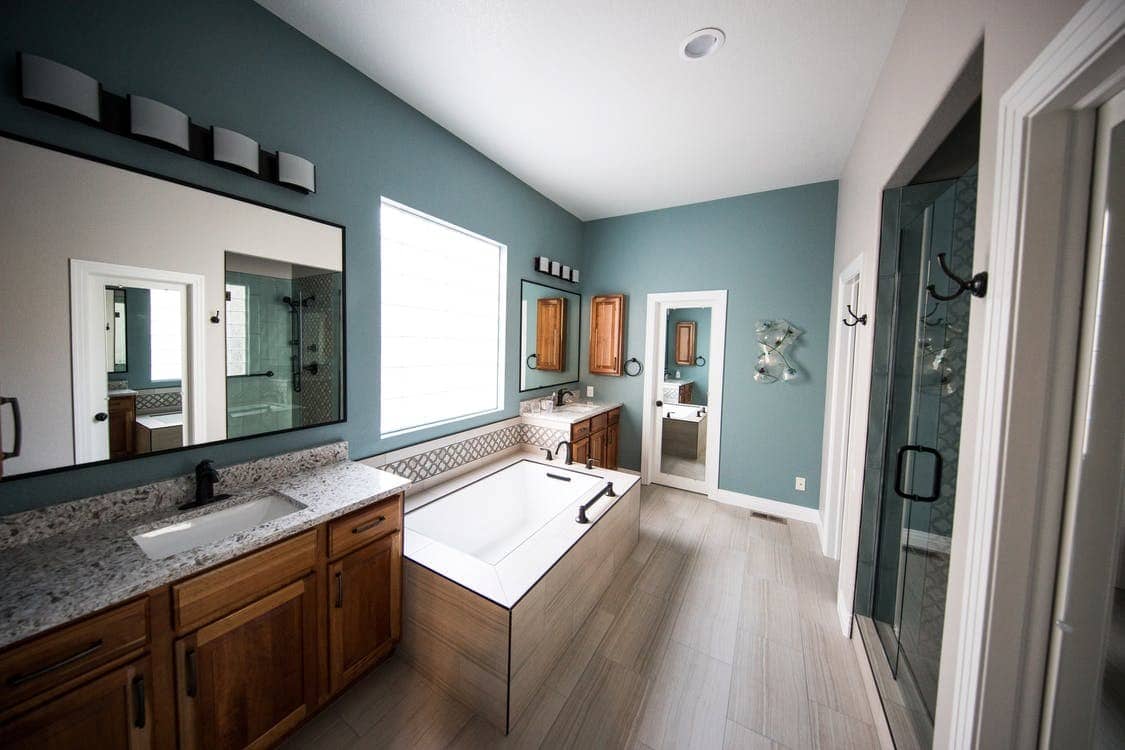
Grey tones add class and sophistication to this timber trimmed bathroom
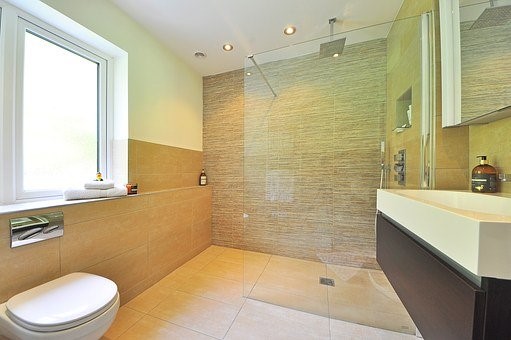
Paint a dado on the bottom half of the bathroom in your chosen colour. Pain the rest of the wall white to create a two-tone look.
HALLWAYS
This is the first part of the inside of the home, visitors will see so make a good impression. Hallways are linking spaces and should give continuity to the overall colour scheme. If you have a long hallway, paint the end wall in a warm shade to make it look shorter.
If you want to make a hallway look longer and more spacious, paint it in a lighter or pastel shade. To choose a colour for the hallway, leave the doors to the adjoining room open so you can see what the overall flow will look like.
DOORS
Paint the edges of the door in the same colour as the face of the door that opens into a room. Paint the hinges in the colour of the adjoining room to create symmetry.
Like our articles? Read our tips on How To Paint A Feature Wall here. You will also want to check out these Popular Colour Combinations For Your Bedroom. Also, don’t forget share this and all our articles on Facebook and LinkedIn.
Not quite sure DIY is the way to go? Consider hiring professional house painters in Melbourne to help you out! Our expert painters in Kew, Laverton, Malvern, Mount Waverley, and North Melbourne are available for various interior and exterior painting services including bedroom painting, garage painting, and even fence painting.


